Risk Heatmap Calculator
Risk Score: 0
Risk = Likelihood × Impact
25% likelihood × 35 impact = 8.75
This is a low-risk scenario. It's unlikely to occur and would have minimal impact if it did.
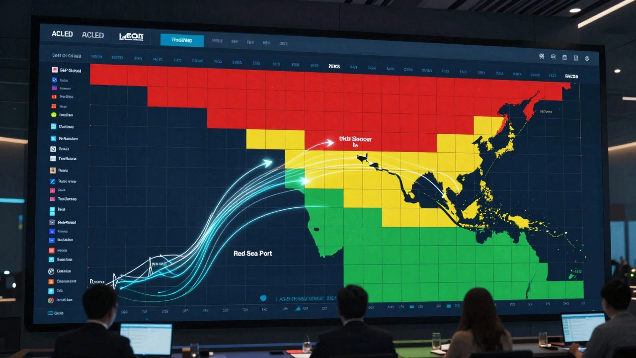
When your supply chain depends on a port in the Red Sea, and that port suddenly shuts down because of war, how do you know it’s coming? When a new tariff hits your biggest export market overnight, how do you react before your quarterly earnings get crushed? When regulators in three countries change compliance rules at once, how do you even track it all? Enterprise risk heatmaps aren’t just pretty charts-they’re the early warning system smart companies use to stay alive in a world where war, trade shocks, and regulation don’t wait for quarterly reports.
What Enterprise Risk Heatmaps Actually Do
An enterprise risk heatmap is a grid. Simple as that. One axis shows how likely a risk is to happen. The other shows how bad it would be if it did. You plot each threat on the grid, color-code it-red for danger, yellow for caution, green for okay-and suddenly, chaos becomes clear. It’s not magic. It’s math. Risk = Likelihood × Impact. That’s the formula. A 70% chance of a tariff hike that could cost $500 million? That’s a red zone. A 10% chance of a minor regulation change that costs $2 million? That’s green. You don’t need a PhD to read it. Executives get it in seconds. That’s why 78% of Fortune 500 companies use them, according to Gartner’s 2025 survey. But here’s the catch: the grid only works if you fill it with real data. Not guesses. Not opinions. Real numbers. Where do those come from? For war risks, it’s data from the Global Peace Index or ACLED, tracking conflict hotspots. For trade shocks, it’s tariff databases from the World Bank or real-time alerts from TradeMap. For regulation, it’s government filings, compliance APIs, and legal monitoring tools that track rule changes in 150+ countries.War Risk: Beyond the Headlines
Most companies think war risk means “what if Ukraine explodes again?” But the real danger isn’t the battlefield. It’s the ripple effect. A factory in Poland stops getting Ukrainian steel. A shipping lane near the Strait of Hormuz closes. Insurance premiums for cargo jump 400%. Your heatmap needs to show those second- and third-order effects. Siemens built a heatmap that pulled in OECD trade dependency data. They mapped every supplier in Eastern Europe and assigned exposure scores based on how much revenue came from that region. When tensions rose in early 2024, their heatmap flagged 89% of at-risk suppliers six months before disruptions hit. That gave them time to find alternatives, reroute logistics, and renegotiate contracts. But Shell’s heatmap missed the same kind of thing in 2024. Their Middle East conflict map showed direct exposure to oil facilities. It didn’t track insurance cost spikes, port closures in the Gulf, or how Western banks were pulling credit from regional traders. The result? $314 million in unplanned costs. The heatmap didn’t fail. The assumptions behind it did.Trade Shocks: Tariffs That Move Faster Than Your Budget Cycle
Trade wars don’t happen in boardrooms. They happen in press releases. One day, the U.S. slaps a 25% tariff on Chinese electric vehicle parts. The next, the EU follows with its own rules. Companies that wait for their finance team to update spreadsheets are already behind. Maersk didn’t wait. They built a 5x5 heatmap with real-time tariff data feeds. Each cell had a dollar value attached: a 10% tariff increase in a key market? That’s $15 million in lost margins. A 30% hike? $50 million. When the U.S.-China tariff escalation hit in 2023, their system auto-updated. They rerouted 14% of their Asia-Europe shipments through the Suez Canal instead of the Pacific. Saved $210 million. The key? They didn’t just say “trade risk = high.” They said “trade risk = $X million impact if tariff rises above Y%.” That’s quantification. That’s action.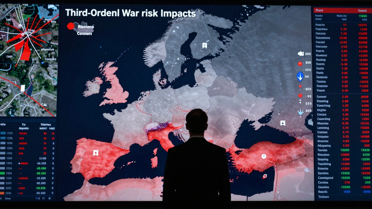
Regulation: The Silent Killer
War and trade shocks make headlines. Regulation? It’s quiet. Until you get fined $100 million. Boeing’s 2023 regulatory heatmap looked fine on paper. They tracked FAA and EASA rules separately. But they didn’t account for overlap. When both agencies changed their certification requirements at the same time, the cumulative cost wasn’t $80 million-it was $2.5 billion. Why? Because their heatmap treated each rule as an isolated event. It didn’t model compound risk. Financial institutions learned this the hard way. Basel III requires them to stress-test for regulatory cascades. That’s why banks now link their heatmaps to compliance engines that auto-pull new rules from the SEC, ECB, and other regulators. Each rule gets a score: likelihood of enforcement, cost of non-compliance, time to implement. One cell might say: “EU Digital Operational Resilience Act (DORA) - 85% likelihood by Q3 2026, $120M impact, 18-month compliance window.”Why Heatmaps Fail (And How to Fix Them)
Heatmaps are powerful-but they’re not perfect. Here’s where they break:- They ignore correlations. War + trade shock + regulation change at the same time? Most heatmaps treat these as separate lines. They don’t add up. Deloitte found companies underestimate compound risks by 42%.
- They’re static. If you update your heatmap once a quarter, you’re flying blind. Geopolitical risks change in hours, not weeks.
- Scoring is inconsistent. Sales says “high impact” means $5 million loss. Legal says it means $50 million. You end up comparing apples to oranges.
- Use real-time data feeds. Integrate with APIs from GeoQuant, Stratfor, or S&P Global. Let your heatmap update automatically.
- Standardize scoring across departments. Create a single risk dictionary. “High impact” means the same thing everywhere. Use dollar values, not vague labels.
- Add velocity. The World Economic Forum’s 2026 heatmap model added a third axis: how fast a risk could hit. A regulation change that takes 18 months to enforce? Low velocity. A tariff that takes effect in 72 hours? High velocity. That changes everything.
What’s Next? Dynamic, AI-Powered Heatmaps
The next generation of heatmaps doesn’t wait for you to click “update.” They predict. Sixty-three percent of large enterprises now use machine learning to forecast risk likelihood. AI models scan news, social media, satellite imagery, and shipping data to predict where conflict might flare or tariffs might rise. LogicManager’s 2025 Trade War Module processes 12,000 tariff notifications daily. That’s not humanly possible. The ISO 31000 standard just updated in 2025 to require “dynamic risk visualization” for companies in volatile regions. That’s not a suggestion. It’s a compliance requirement. But here’s the warning from Aon’s 2025 Risk Report: “Over-automation may reduce critical thinking about emerging threats like hybrid warfare tactics.” AI can tell you a risk is likely. But only a human can ask: “What if this isn’t just a trade war? What if it’s a currency collapse? What if it’s cyber sabotage disguised as a tariff?”
How to Build One (Without Getting Lost)
If you’re starting from scratch, here’s a real-world roadmap:- Identify risks (2-4 weeks): Bring together supply chain, legal, finance, and operations. List every possible threat from war, trade, and regulation. Don’t skip the weird ones.
- Define scoring (1-2 weeks): Agree on what “high likelihood” and “high impact” mean. Use dollar values. Use percentages. Be precise.
- Gather data (3-6 weeks): Pull in historical data, real-time feeds, and third-party risk scores. Use ACLED for conflict, World Bank for trade, government portals for regulation.
- Build the map (2-3 days): Use tools like Riskonnect, LogicManager, or even Power BI. Color-code. Keep it simple.
- Validate and update (ongoing): Review it monthly. If a risk moves from yellow to red, you need a plan. Not a report. A plan.
Who Uses This-and Who Doesn’t
Adoption is highest where the stakes are highest:- Financial services: 98% use heatmaps. They’re regulated, exposed to global markets, and can’t afford surprises.
- Energy: 95%. Oil, gas, and renewables are tied to global politics and sanctions.
- Manufacturing: 89%. Global supply chains are fragile. One broken link can shut down a factory.
- Higher education: 76%. Surprisingly high. Endowments are global. Research funding depends on trade and immigration rules.
The Bottom Line
Enterprise risk heatmaps won’t predict the future. But they’ll tell you where the landmines are right now. They turn noise into clarity. They turn fear into action. The companies that survive the next five years won’t be the ones with the biggest budgets. They’ll be the ones who saw the risk coming-and moved before it hit. If your risk map still looks like a PowerPoint slide from 2020, you’re already behind. Update it. Connect it. Make it dynamic. Because the next war, the next tariff, the next regulation isn’t coming next quarter. It’s already in motion.What’s the difference between a risk heatmap and a risk register?
A risk register is a detailed list-usually a spreadsheet-of every risk, with descriptions, owners, mitigation plans, and status. It’s comprehensive but hard to scan. A heatmap is a visual summary that shows only the most critical risks, ranked by likelihood and impact. Think of the register as your full medical file and the heatmap as your emergency triage chart. You need both, but the heatmap tells leadership what to act on right now.
Can I build a risk heatmap in Excel?
Yes, you can. Many companies start there. But Excel heatmaps are static. They don’t auto-update with real-time data. If a tariff changes overnight, your Excel file won’t know. For basic internal use, Excel works. For global operations with war, trade, and regulatory risks, you need software that connects to live data feeds like TradeMap, ACLED, or S&P Global. The cost of a missed risk far outweighs the cost of better tools.
How often should I update my enterprise risk heatmap?
At minimum, quarterly. But for risks tied to war or trade, update weekly-or even daily. During active conflict or tariff negotiations, risks can shift in hours. The best companies use automated data feeds that trigger alerts when a risk score changes. Manual updates are too slow. In today’s world, a heatmap that hasn’t been refreshed in 30 days is already outdated.
Are risk heatmaps enough for compliance?
No. Heatmaps are a communication tool, not a compliance system. Regulators like the SEC and Basel Committee require documented risk assessments, audit trails, and stress tests. Heatmaps show the big picture, but you still need detailed records, control frameworks, and independent reviews to prove you’re compliant. Use the heatmap to show leadership what matters. Use your compliance system to prove you’re doing something about it.
What’s the biggest mistake companies make with risk heatmaps?
Treating them as a one-time project instead of a living system. Many companies build a heatmap once, print it, and forget it. Risk doesn’t sit still. War zones shift. Tariffs change. Regulations evolve. A heatmap that isn’t updated regularly becomes a false sense of security. The most successful companies treat theirs like a dashboard-monitored daily, reviewed weekly, and refreshed with live data.
If you’re managing risk in a global business, you’re not just planning-you’re navigating a minefield. Enterprise risk heatmaps don’t clear the mines. But they show you where to step.